Skip to content

Portfolio

Hello, I’m

Aliya Nashwa

A UI/UX Designer

ABOUT ME 

I’m a creative designer focused on UI/UX Design, Graphic Design, and Web Design. I enjoy creating clean, modern, and user-friendly designs that combine creativity with functionality. I’m passionate about turning ideas into engaging visual experiences and continuously improving my design skills.

Tools That I’ve Mastered 

UX/UI Case Study

Logofolio

Urban Zip
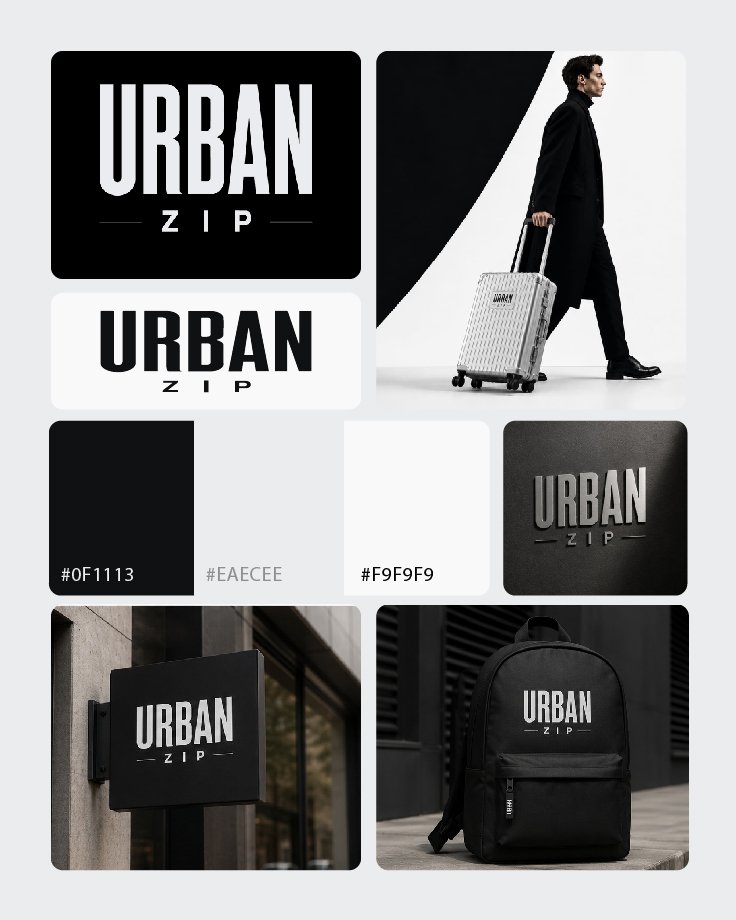
Urban Zip is a fictional travel bag brand created for people who enjoy trekking, travelling, and exploring new places. The brand focuses on making travel feel simple, practical, and stylish, while keeping the needs of modern travellers in mind.


The logo uses a bold and minimal design to represent strength, movement, and an urban travel lifestyle. The black, white, and grey colour palette gives the brand a clean and modern look, while the strong typography makes Urban Zip easy to recognise across bags, travel gear, and other brand applications.


Charmed by Crochet

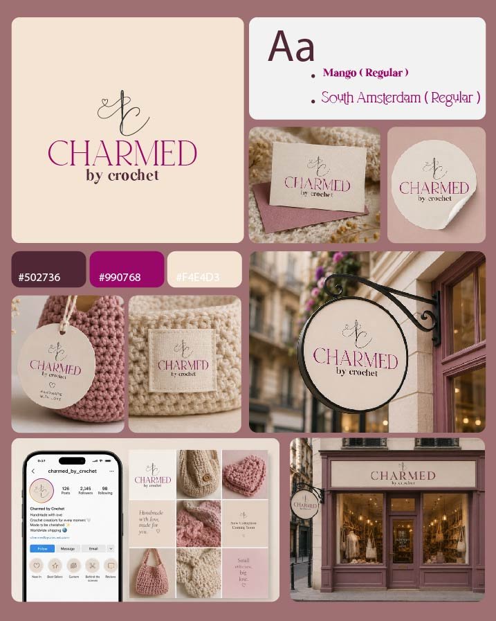
Charmed by Crochet is a fictional crochet shop created for people who enjoy the art of crocheting and handmade crafts. The brand focuses on creativity, comfort, and the charm of handmade products, making crochet feel warm, personal, and enjoyable.
 

The logo combines an elegant wordmark with a simple crochet-inspired line symbol and a small heart, representing creativity, care, and the handmade nature of the brand. The soft colour palette and delicate typography give Charmed by Crochet a warm, feminine, and friendly personality.


Charmed by Crochet

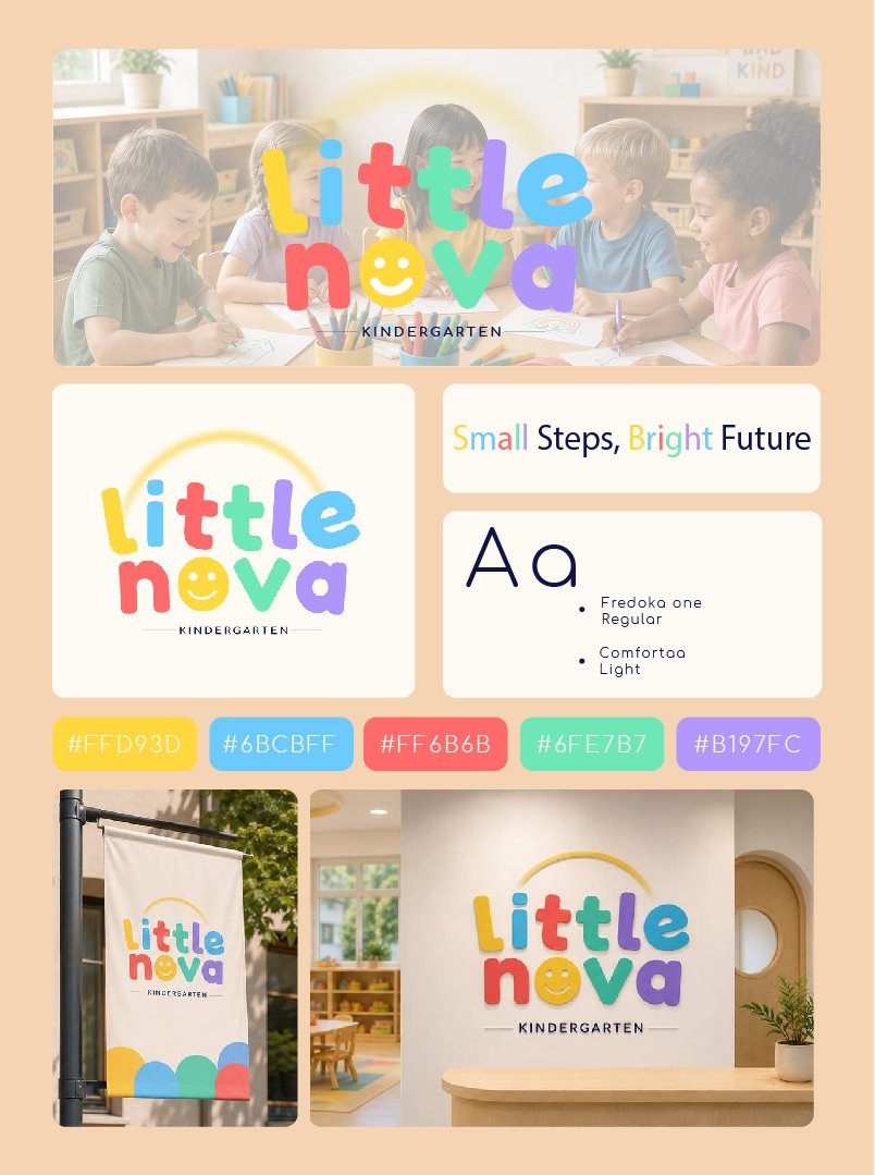
Little Nova Kindergarten is a fun and welcoming learning space created for young children to explore, learn, and grow. The brand focuses on making early education enjoyable through playful activities, creative learning, and opportunities for children to develop important social and everyday skills.


The logo uses bright, soft colors and playful letterforms to reflect the energy, creativity, and happiness of childhood. The friendly design creates a warm and approachable identity that represents Little Nova as a place where children can learn, make friends, discover new interests, and enjoy every step of their early learning journey.


Fruzi

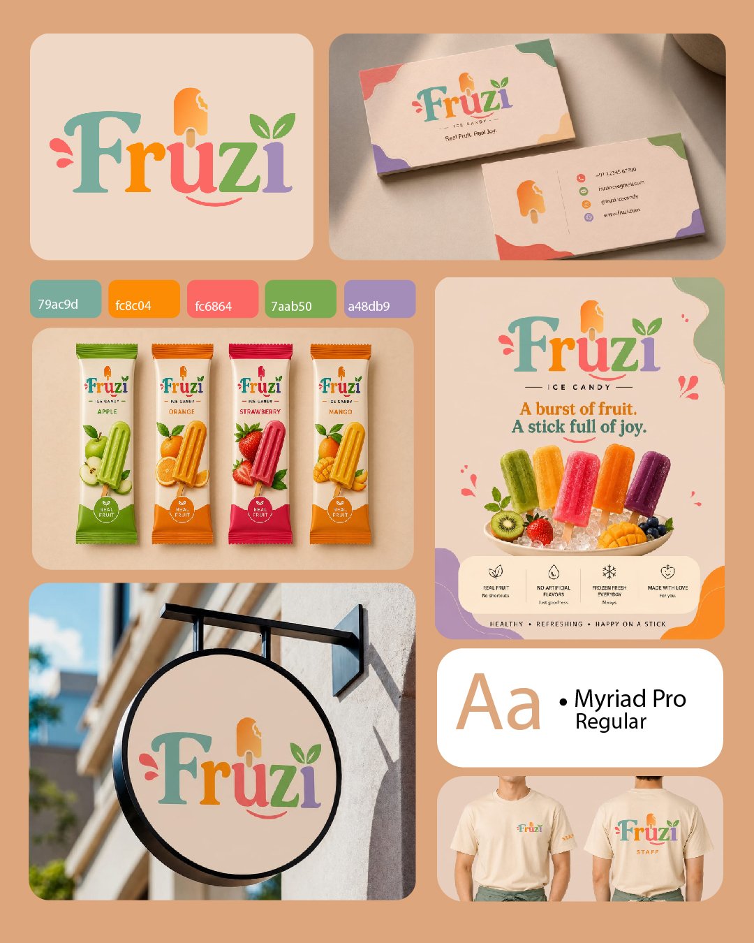
Fruzi is a fun and colorful ice candy bar brand created for people who love fruity and sweet frozen treats. The brand brings together the freshness of fruit and the playful feeling of candy in a bright and youthful identity.


The logo uses soft, vibrant colors and playful typography to create a cheerful and refreshing look. The ice candy and leaf elements highlight the brand’s fruity and frozen nature, making Fruzi feel fun, friendly, and easy to remember.


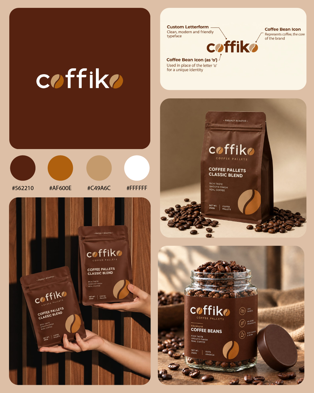
Coffiko

Coffiko is a fictional coffee pellet brand created for people who enjoy a rich and natural coffee experience. The brand focuses on quality coffee made from natural coffee pellets, bringing a simple and authentic feel to every cup.


The logo combines a clean, modern wordmark with coffee bean elements to create a strong connection to the product. The warm brown background and earthy coffee tones give Coffiko a cozy and premium personality, while the simple design keeps the brand fresh and easy to recognize.


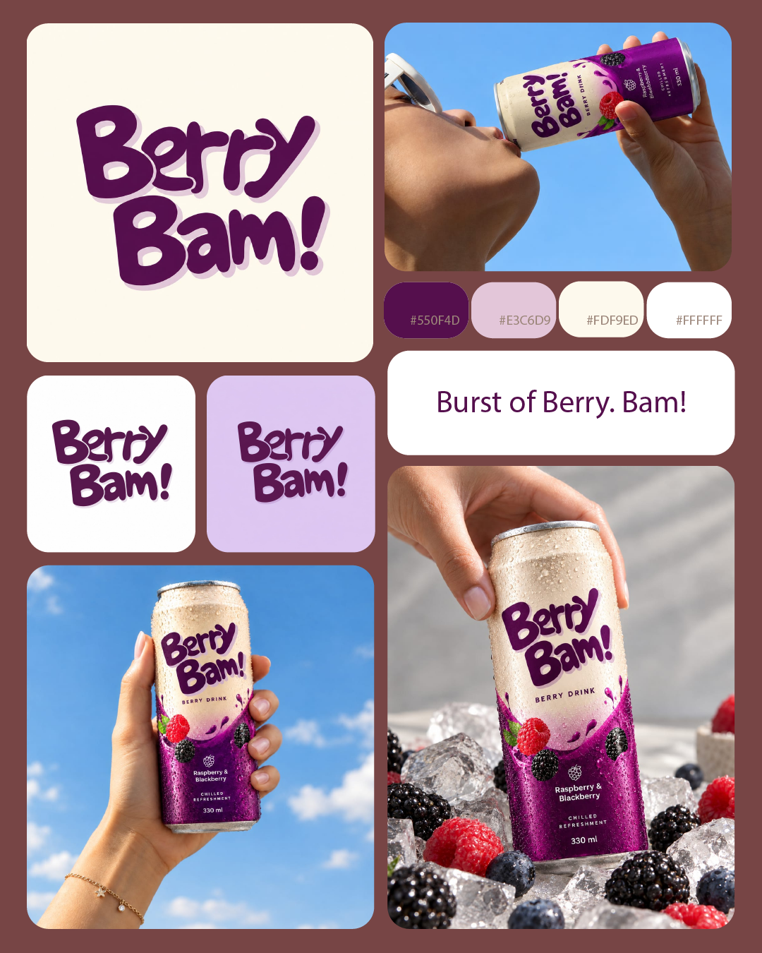
Berry Bam!

Berry Bam! is a fun and refreshing berry drink brand created to bring a burst of fruity energy with every sip. The brand name captures the exciting feeling of taking the first sip and getting an instant “Bam!” of berry flavor and freshness.


The logo uses bold, playful lettering to give the brand a youthful and energetic personality. The purple color connects with berries while the soft shadow adds depth and a modern touch. Overall, Berry Bam! is designed to feel fun, refreshing, and memorable for people who enjoy fruity drinks with a little extra excitement.


Dayshade

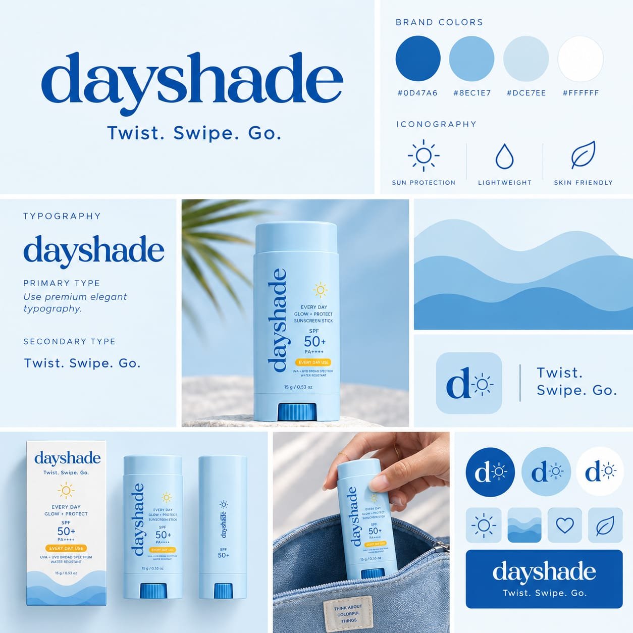
Dayshade is a concept sunscreen stick brand designed to make sun protection simple, convenient, and easy to use every day. Its compact stick format makes it easy to carry and apply anytime, making it suitable for people who are always on the go. The brand focuses on providing comfortable and safe sun protection for all skin types.


The visual identity uses blue as the main color, representing safety, trust, freshness, and protection. The clean typography and simple design give Dayshade a modern and approachable look, creating a brand that feels reliable while still being youthful and easy to connect with.


Package designs